Header
Table of contents
Header
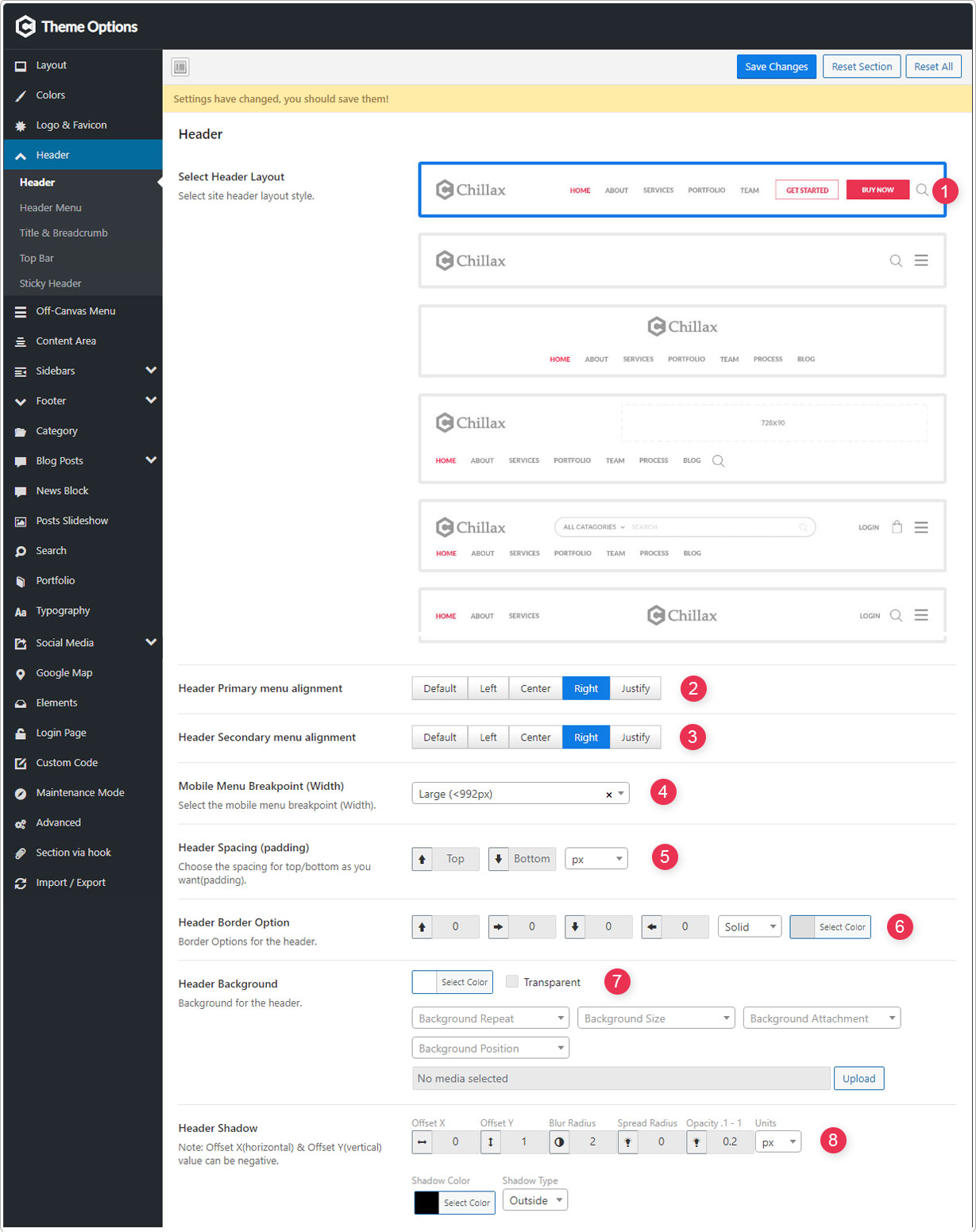
- Select Header Layout -Select site header layout style.
- Header Primary menu alignment - Header primary menu (Main menu) position/alignment.
- Header Secondary menu alignment- Header secondary menu position/alignment.
- Mobile Menu Breakpoint (Width) - Mobile menu breakpoint for the responsive design.
- Header Spacing (padding) - Choose the spacing for top/bottom as you want(padding).
- Header Border Option - Border Options for the header.
- Header Background - Background for the header.
- Header Shadow - Offset X(horizontal) & Offset Y(vertical) value can be negative.
Header Menu
Header Primary & Secondary menu options!
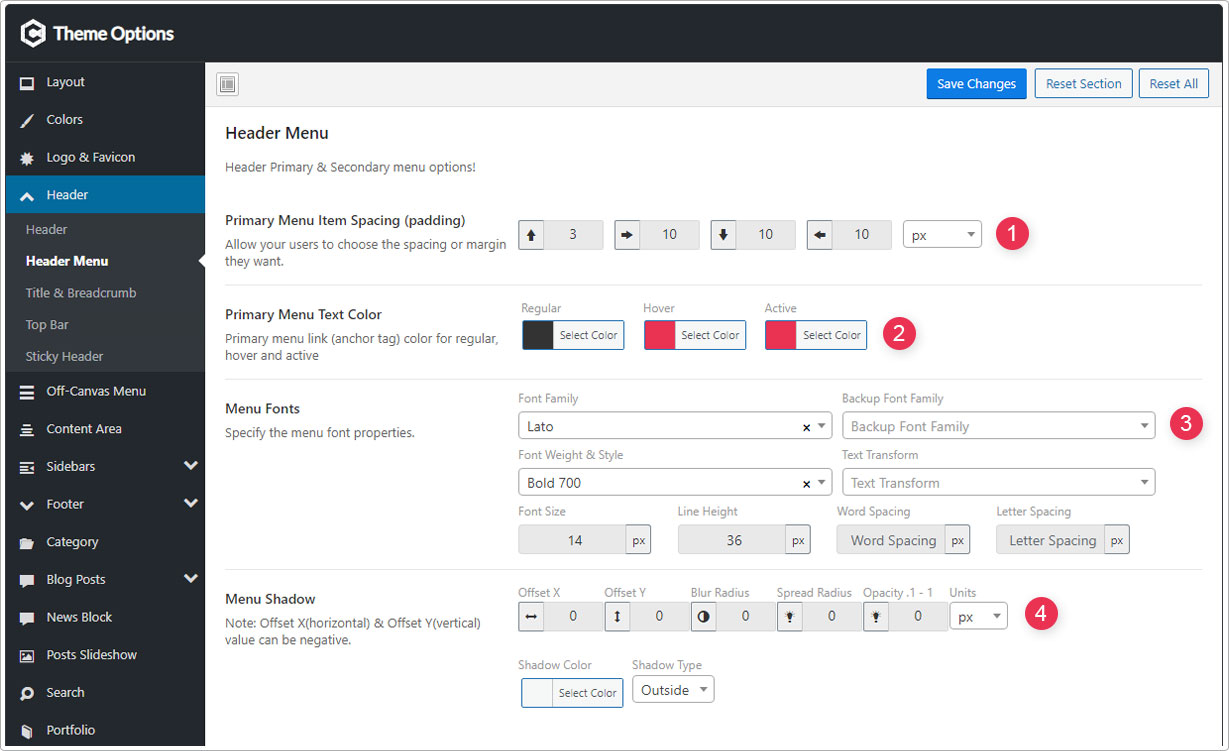
- Header Menu Item Spacing (padding) - Allow your users to choose the spacing or margin they want.
- Header Menu Text Color - Header menu link (anchor tag) color for regular, hover and active.
- Menu Fonts - Specify the menu font properties.
- Menu Shadow - Offset X(horizontal) & Offset Y(vertical) value can be negative.
Title & Breadcrumb
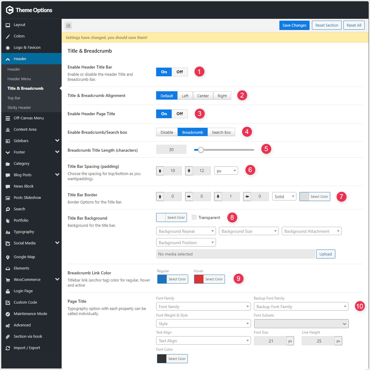
- Enable Header Title Bar - Enable or disable the Header Title and Breadcrumb Bar.
- Title & Breadcrumb Alignment - Title & Breadcrumb position/alignment.
- Enable Header Page Title - Control page title on “Title & Breadcrumb” area.
- Enable Breadcrumb/Search box - Breadcrumb or Search box on “Title & Breadcrumb” area.
- Breadcrumb Title Length (characters) - Control the breadcrumb title length by specifying the number of characters.
- Title Bar Spacing (padding) - Choose the spacing for top/bottom as you want(padding).
- Title Bar Border - Border Options for the Title Bar.
- Title Bar Background - Background for the title bar.
- Breadcrumb Link Color - Titlebar link (anchor tag) color for regular, hover and active.
- Page Title - Typography option with each property can be called individually.
Top Bar
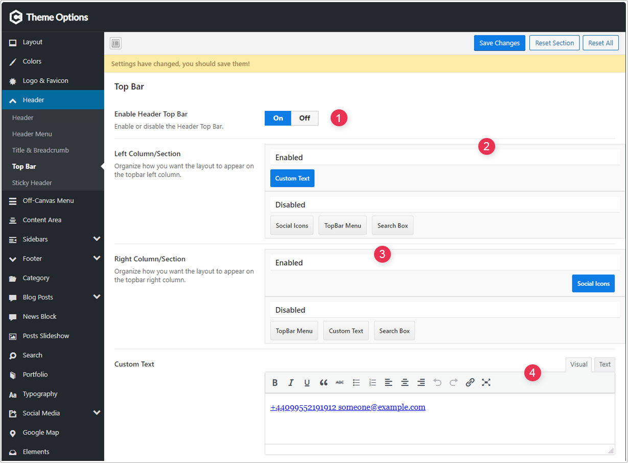
- Enable Header Top Bar - Enable or disable the Header Top Bar.
- Left Column/Section - Organize how you want the layout to appear on the topbar left column.
- Right Column/Section - Organize how you want the layout to appear on the topbar right column.
- Custom Text - Topbar custom text.
Topbar Styles
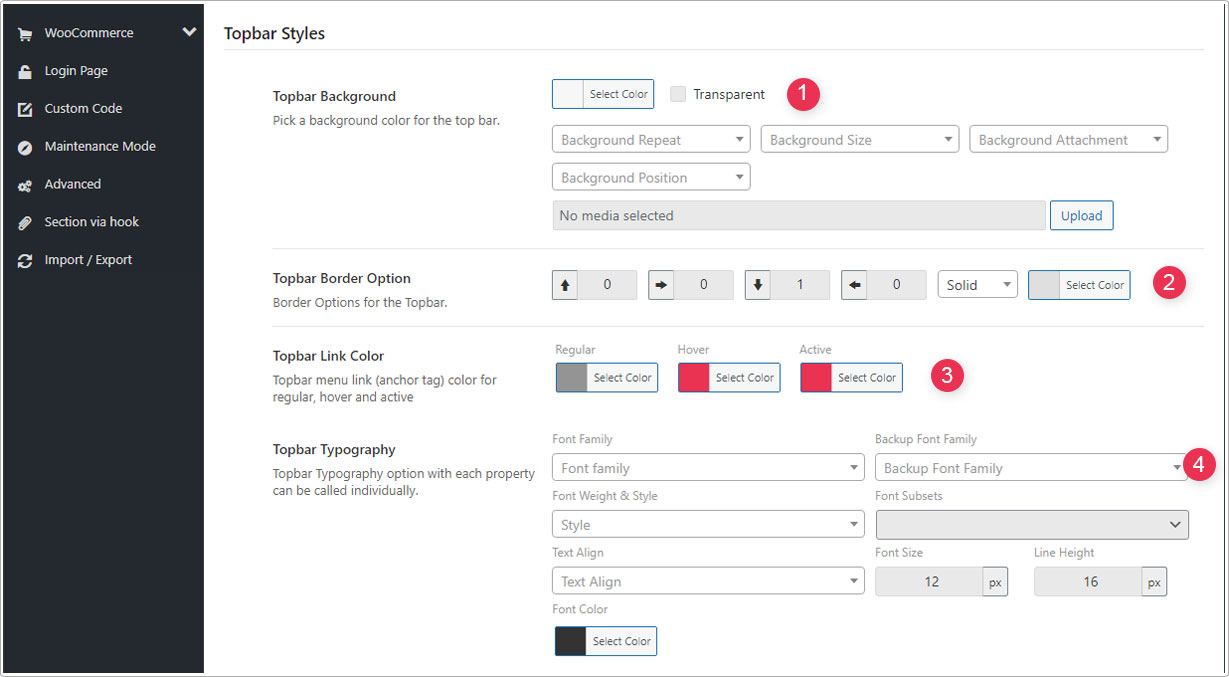
- Topbar Background - Pick a background color for the top bar.
- Topbar Border Option - Border Options for the Topbar.
- Topbar Link Color - Topbar menu link (anchor tag) color for regular, hover and active.
- Topbar Typography - Topbar Typography option with each property can be called individually.
Sticky Header
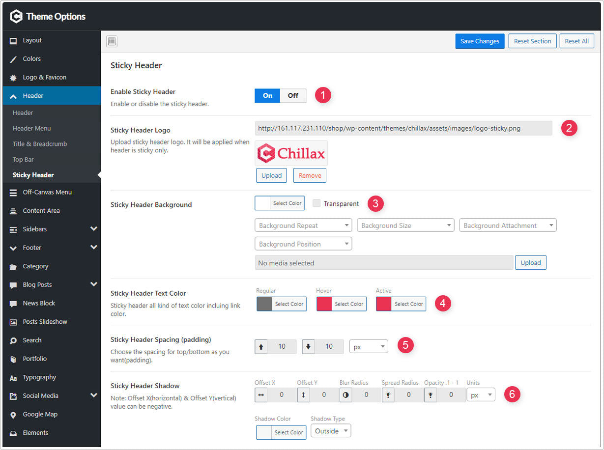
- Enable Sticky Header - Enable or disable the sticky header.
- Sticky Header Logo - Upload sticky header logo. It will be applied when header is sticky only.
- Sticky Header Background - Sticky header background with image & color.
- Sticky Header Text Color - Sticky header all kind of text color incluing link color.
- Sticky Header Spacing (padding) - Choose the spacing for top/bottom as you want(padding).
- Sticky Header Shadow - Offset X(horizontal) & Offset Y(vertical) value can be negative.